Building Websites Using Responsive Design
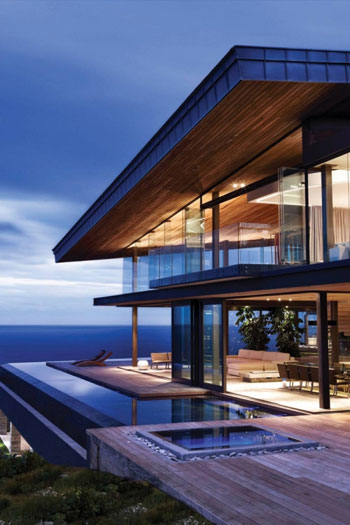
If you’re planning to build a beautiful home perched on the edge of a cliff, of course you’ll want to choose a design that will keep the structure from tumbling off into the abyss. Likewise, building a beautiful website requires important design considerations that will enable your finished product to be functional, stylistically appropriate, and—ultimately—a spot-on representative of you and your business.
Responsive Web Design
Responsive web design makes use of a design approach that considers how to create the most appropriate viewing experience for users accessing websites from a wide range of devices. Home builders might consider environmental elements such as the steepness of a slope, snow load, aspect, and location in order to produce the best architectural design, just as website builders make use of responsive web design to create an optimal viewing experience for users on mobile phones, desktop computers, tablets, and more.
Web designer Ethan Marcotte makes an eloquent analogy comparing responsive architecture design to responsive web design. Marcotte discusses how, in the emerging discipline of responsive architectural design, a room or space automatically adjusts to the number and flow of people within it: “Through a combination of embedded robotics and tensile materials, architects are experimenting with art installations and wall structures that bend, flex, and expand as crowds approach them.” Just as architects create spaces to interact with people, web designers build websites so our visitor’s have the best experience possible from their viewpoint of choice.
But how do web designers create these shape-shifting sites that beautifully adapt to multiple devices? Fortunately, we’ve got technical elements such as fluid grids, flexible images, and media queries to help. These technologies respond to the user’s preferences, eliminating the need for a different design and development phase for each new gadget on the market. The mighty media query is the key that allows us to target not only certain devices, but to actually inspect the device rendering our work.
Media Queries
Media queries are a CSS3 module and became a World Wide Web Consortium (W3C) recommended standard in June 2012. They are an excellent way to deliver different styles to different devices, providing the best experience for each type of user. At Maven Design Studio, we tailor the styles according to device attributes and then specify which style to load for the user’s environment.
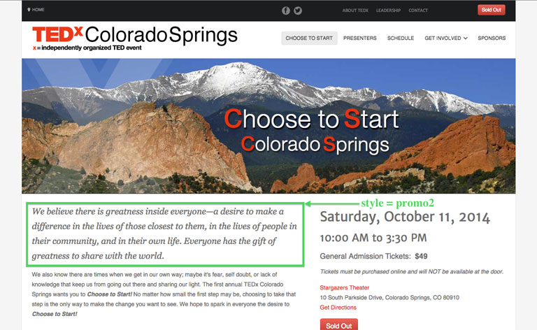
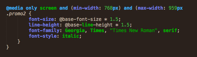
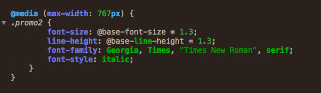
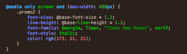
Let’s look at a simple example: The website we designed for the 2014 TEDx Colorado Springs event that has an introductory paragraph on the home page that is styled according to a classification called “promo2” to render a defined font, in italics, at a particular size, line height, and sometimes with change in color.
The three media queries below, in this case, deliver a defined font size, color, and line height based on the user’s device.
If the user is on a tablet size screen, it produces these style specifications:
Then if the user is on a mobile size screen, it produces these style specifications:
And then if the user is on a small mobile size screen, it produces these style specifications:
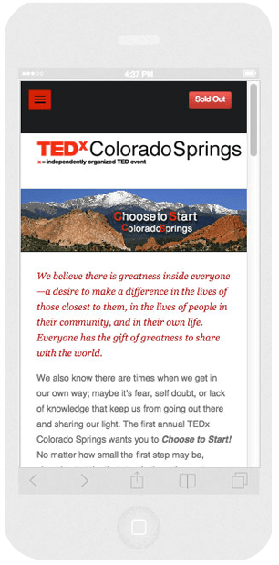
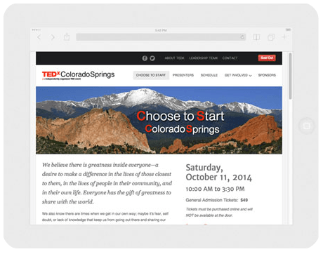
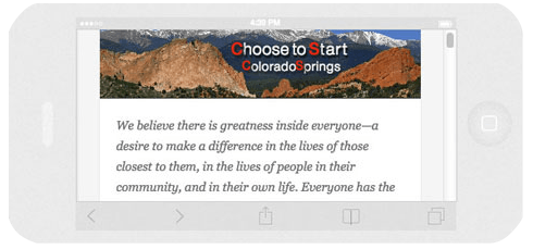
Other elements on the home page appear on larger screens but not on mobile. If you are reading this from a device where you can use a mouse, try narrowing the width of your browser’s window, and you’ll see some items either disappear or move on a smaller screen. These types of changes are all part of responsive design. Because TEDx Colorado Springs was an event, we wanted to emphasize ticket sales and make it very easy for people to buy tickets. On a mobile device in particular, we removed most of the images from the home page, moved the social media icons and secondary menu items further down the page, and placed buy buttons in two locations. We’re always looking for ways to make our sites easy on the user; easy to read, easy to navigate, easy to take action.
Design for People and Use Technology
People and their experience on our sites should be at the core of all web design. With that as our foundation, it’s only then that we use technology to help us deliver the experience. Technical ingredients such as media queries make responsive web design possible, but it’s a new way of thinking about design that drives the process. Instead of finding the same static image or the same text location when they access the same website on different devices, users will find that responsive web design enables their experience not only to be more flexible but also more adaptable. In this way, responsive web design also allows for a finished product that’s more responsive to the needs of our users.
– Karen Dunne, Principal and Lead Designer at Maven Design Studio